Thursday, February 21, 2008

GASP!

OH MY GOD I WANT THIS!


It's graffiti artist Der's contribution to the new French Dunny series. The rest are coated in your standard crazy cool paint jobs, but this one is actually a little French dude! He's holding a little baguette and wine bottle and wearing a beret! Awwwww... I want I want I want!

Kazuhiro Okamoto’s “Translucent”


I’ve been consuming comics like crazy lately, but the titles I regularly follow have been coming out too slowly. So I decided I need to add another new series to my palate. I really want something different, though: no high school romance or boy-on-a-quest stories. Last week, I picked up the first two volumes of Kazuhiro Okamoto’s “Translucent” (from Dark Horse Comics), an unusual story that seemed promising.

“Translucent” focuses on 14-year-old Shizuka, who is afflicted with “translucent syndrome,” a disease that makes her body “see-through.” It affects each person differently, with some people being completely transparent all the time and some (like Shizuka) regularly shifting from visible to varying degrees of translucency. Emotions also affect the syndrome, with negative feelings and stress causing Shizuka to go completely transparent and happiness causing her body to return to normal. If someone with translucent syndrome remains completely transparent for two weeks, it’s likely she’ll stay that way forever.

“Translucent” was a promising concept in theory. An adolescent girl with an unusual disease should allow for some entertaining drama. But in reality, the series falls completely flat. For one thing, there isn't enough attention given to the disease itself. We’re repeatedly told that there’s no known cause or cure. And that’s it. I can suspend my disbelief enough to ignore the scientific impossibilities at work here, but wouldn’t there be people studying this disease? Shouldn’t Shizuka at the very least exert some effort into understanding it?

For another thing, the art is totally unimpressive. The characters aren’t detailed enough to tell them apart. Shizuka’s friend Mamoru is supposed to be the most beautiful student in the entire school, but the only difference between her and Shizuka is their hairstyles. Bodies and body movement are also rendered extremely stiffly.

I could get past the amateurish art if the story itself was well told, but, unfortunately, it’s not. Problems wrap up much too simplistically to be enjoyable. In the first volume, Shizuka’s body turns completely transparent, so she has to move away to be close to a translucent syndrome specialist. But a special parting gift from Tadami makes her so happy that her body returns to normal, so the doctor tells her she only has to visit once a month and Shizuka returns to her old school. This quick fix and lack of development is unsatisfying.

There also appears to be no overarching storyline. This story really needs a concrete direction. I thought Shizuka’s desire to become an actress despite her condition (which develops after her successful drama club performance) would be the spine of the story, but it’s more of an afterthought, really, happening concurrently to the plot rather than driving it.

I actually ended up returning these books to the store because they’re so unsatisfying. It’s really disappointing to see such a creative theme executed so poorly. Next time I want to try a new manga, I’m going to read the whole thing in-store before buying it.

Tuesday, February 12, 2008

luuuuuurve

I found yet another artist in my internet travels with whom I've fallen in love. Audrey Kawasaki's paintings are STUNNING. She paints these charming art-nouveau inspired wispy girls on wood. The girls have oversized, incredibly expressive eyes and juicy lips, an obvious anime/manga influence. Most of the figures are transparent, so you get to see the woodgrain through them, which gives the paintings a natural, warm feeling. Audrey also retains a sense of edginess by incorporating explicit and metaphorical sexual imagery, as well as the occasional skull or animal skeleton.

Here is a big ole' image dump of some of my favorites from her website:


Audrey currently has a solo show at the Copro Nason gallery in Santa Monica. I desperately wish I could be there. And even though the show only opened three days ago, all her prints and originals are already sold out. All her prints in her personal website's store have also been sold out for some time now. Curses! I really need to take a trip to California one of these days to check out their art scene. Goodness knows there's no shortage of local talent here in New York, but the art establishment in Cali seems more lighthearted, varied, and less elitist, if I'm basing my impression on the art alone. Bits of California culture in general (skateboarding, movie-making, pop culture...) seem to be allowed (embraced?) into the art scene there. For someone to be big in New York, their art has to be Very. Serious. It's like... lighten up! You'd never see something anime-inspired in Chelsea. Maybe Brooklyn, though... Good thing I live there :]

Wednesday, February 6, 2008

heehee

Ok, this cracks me up to no end:

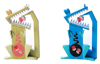
It's a vinyl toy designed by Amanda Visell. Its name is "Baby-Eating Crocodile."

HA!

And here are two illustrations from her website to accompany it:
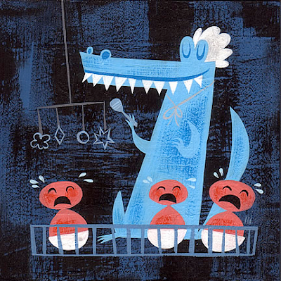


HILARIOUS!

The figure was originally part of a multi-artist show at Gallery 1988 in LA, and now the whole series of toys are being released as a blind-box set. I think the set as a whole is kind of meh, though, which is especially disappointing given the awsomeness of Visell's contribution to the collection. As an art show, all the different styles may work, but as a blind-box set, there's not enough cohesion. And it's not just the art styles that differ wildly, it's also the level of detail. The individual boxes are $7.99 each, which is about average (i.e. expensive as hell), but I wouldn't want to pay that for (or even own, for that matter) a couple of these.

Anthony Ausgang's Clean One, for example, features bright, fun colors, but the character's lack of detail gives it a flat and boring look overall. Peter Gronquist's Stella and 'Roo is also unsatisfying. There's a seem right down the center of its tummy! What's that about? Who thought that was a good design choice? The colors, too, are bland. Designer toys are usually immaculately put together and cleverly colored, so this one looks cheaply made by comparison.

On the other hand, Greg Simkins' Scurvy Nevil is highly detailed and intricate (not to mention, ADORABLE). I covet this little trinket like nobody's business. Joe Ledbetter always comes through with amazing toy creations, and his Ledkin and King of the Deadbeets are no exception. This is how you do mock 2D. The creatures, being actual toys, are obviously physically three-dimensional, but his heavy black outlines and solid, stark color blocks give the little guys the feeling of being drawings on a page.

About half of these toys are really creative and weirdo, while the others aren't particularly special. And even though they're sold as a set, none of them match. They're better as singular pieces; but in that case, I don't want to shell out eight bucks in the hope of getting a Joe Ledbetter or Amanda Visell toy, only to end up with some ugly thing I don't want. Let's face it, $8 is too much to pay for a three inch chunk of plastic anyways (not that it's ever stopped me before...), so if I'm going to actually pay that, it has to be for something unique and clever whose design looks like it received a lot of work. The odds of getting that in this case aren't high enough. My advice? Wait a couple months, then buy them pre-opened on ebay.

Tuesday, February 5, 2008